A few months ago, we faced a challenge that, on the surface, seemed simple: implementing a user menu for our platform.
What started as a quick implementation to get things rolling, turned into an iterative process where we believe we've successfully brought industry best practices to our particular case. All step by step, with lots of teamwork, and most importantly, enjoying the journey.
In this post, we'll tell you about the entire process: from the first ideas to the final implementation, including internal debates, references we analyzed, and decisions we made at each step.
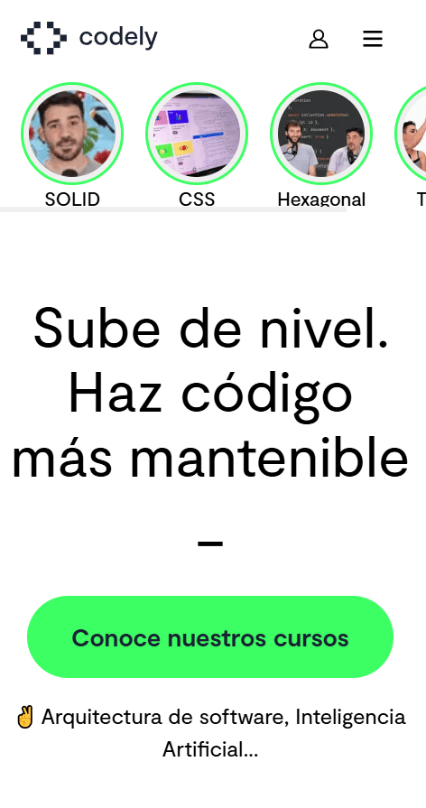
🌱 The starting point: Backend trying to center a div
Believe it or not, after 10 years we didn't have a user menu on our website. The only thing we had was the user menu from the platform we use for courses, and the needs we saw you users of Codely had from the feedback you give us.
To cover this need, a first functional and minimalist prototype was implemented. The goal was to have something functional quickly, validate that it met the basic needs, and use it as a base to iterate on.
First version, functional but very simple
This version worked and served its purpose. But it was "just another menu":
- It lacked the visual love of trying to go a step further
- It didn't integrate with the visual identity of the rest of the page by not following the Design System
- It wasted the potential of such a critical element as a user menu, beyond just grouping links
🎨 Integration with the design system
With the basic functionality validated, it was time to give it a visual boost. We had a prototype in Figma that improved the component's design to bring it closer to the rest of the application's elements.
Mockup in Figma
Although it looked good in isolation, there were some things that didn't quite fit. Especially after years of using our Design System.
We saw that some new visual elements (like overly pronounced shadows) broke consistency with the rest of the application. They looked good on the isolated component, but clashed with the design system we'd been using for years.
The first learning: take into account visual cohesion with the rest of our application.
🛠️ First iteration: A step forward, but a long way to go
With a design to follow (despite having details that grated on us), we got to work. The goal was to have something production ready that would start to lay a solid foundation.
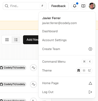
Closed menu showing avatar
Open menu covering the initial avatar and showing a new one inside
With these changes, the potential of what it could become was starting to show.
But there were still many things to polish. Above all, there was a detail that would become evident later: we hadn't thought enough about conversion opportunities.
🔍 Learning from those who have already faced the same problem
Before continuing to iterate blindly, we decided on something that turned out to be key: analyze how products we admire do it.
This research phase was fundamental to understanding common patterns and best practices. And to avoid reinventing the wheel (poorly).
Supabase
What we liked:
- Doesn't overlap the modal with the trigger. Avoids visual confusion.
- Assumes that if you see your avatar, you know there's configuration there
What we didn't like:
- Too minimalist, doesn't integrate elements that take advantage of this type of components
- Doesn't take advantage of the space for useful information
Supabase user menu
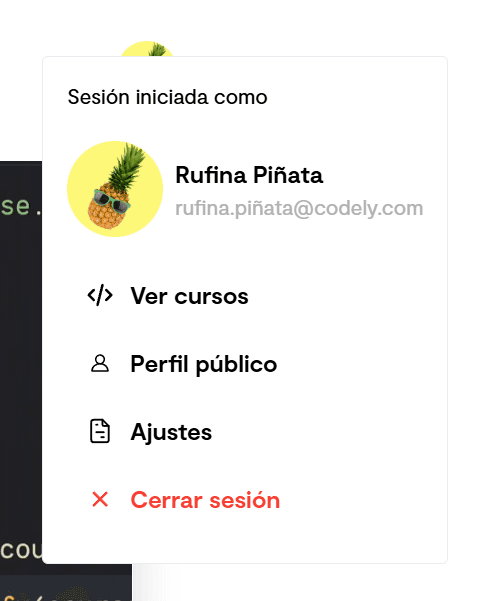
Retool
What we liked:
- Shows relevant information (user role)
- Clear dropdown indicator
What we didn't like:
- Repeating the avatar inside the menu is redundant
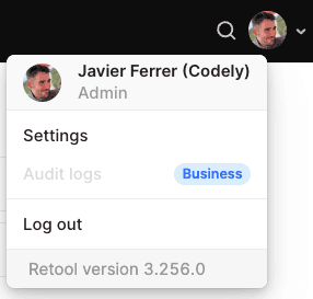
Retool user menu
Raycast
What we liked:
- Subtle animation on hover
- Clean and easy to understand menu
What we didn't like:
- Too minimalist, doesn't integrate elements that take advantage of this type of components
Raycast user menu
Other inspirations that confirm our learnings
We also analyzed other products, although we were already starting to notice repeating patterns.
User menu in Vercel
User menu mockup found in Figma community
The patterns we identified
After analyzing multiple products, we identified several common patterns that we were interested in starting to apply:
- Grouping of elements
- Separated destructive action
- Standard iconography
- Contextual information
🔄 Applying the identified patterns
With these clear references, it was time to implement a more polished version.
It wasn't just about copying what others did, but about adapting best practices to our specific context.
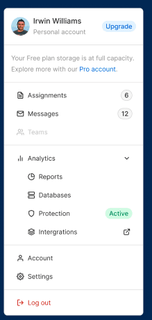
Group related elements together
We started organizing the dropdown content into logical sections:
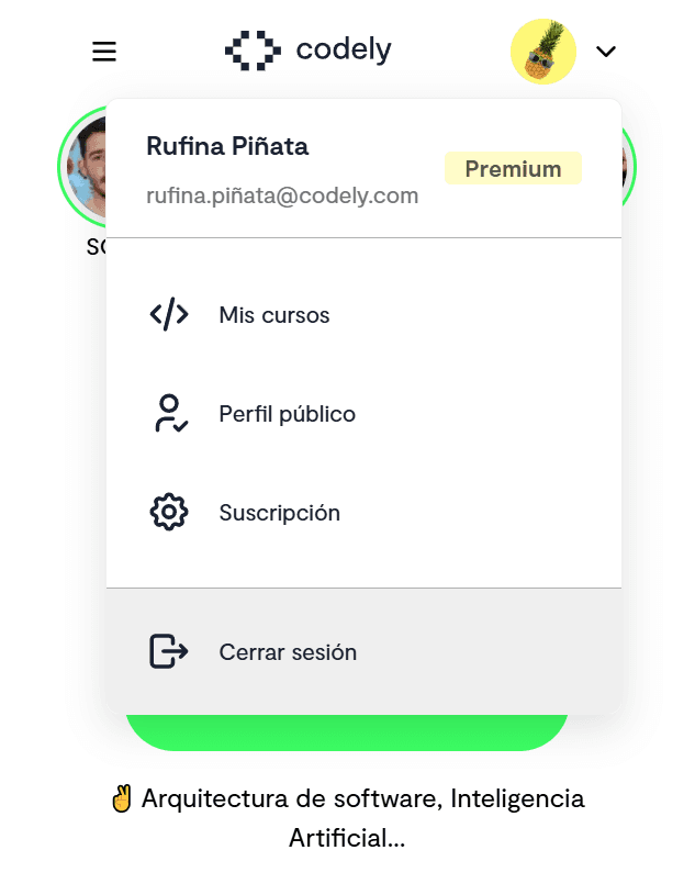
- User information (name, email, plan badge)
- Main navigation (my courses, public profile, settings)
- Destructive action (sign out)
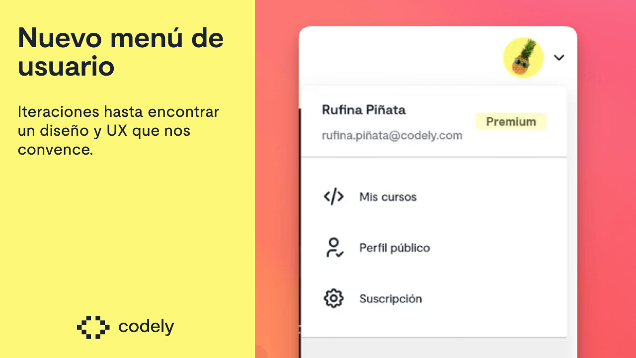
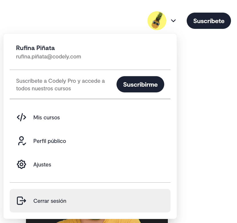
We start to include subscription type in the menu
Separate the destructive action
Following a widespread pattern, "Sign out" is separated from the rest of the options. A clear visual separator indicates it's a different action.
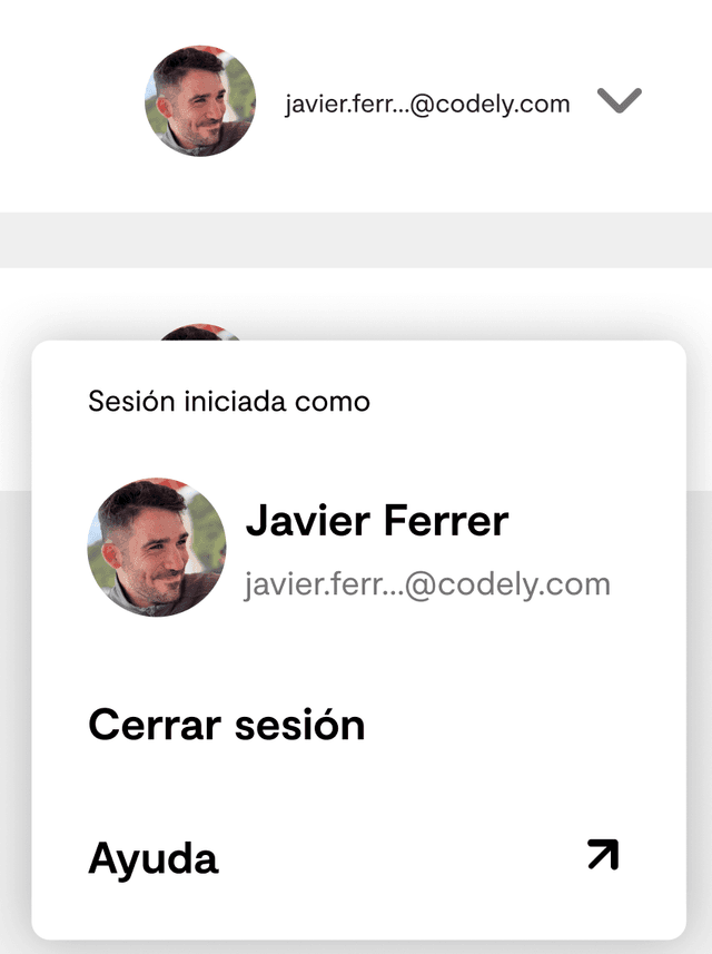
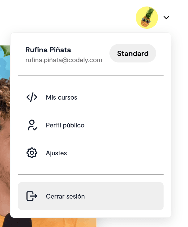
Assume the user is not dumb
We eliminated unnecessary redundancies that only added noise:
- Remove "Signed in as": If you see your avatar, you already know you're logged in
- Don't show email or name next to the avatar when the dropdown is closed: The avatar is already a sufficient indicator
- Show relevant information only when necessary
The avatar is enough to know the user menu is there
Use standard iconography
We changed to icons that users have likely already seen in other applications:
- Gear for configuration/settings
- Door with arrow for sign out
- Code for "My courses"
This makes the menu more intuitive, allowing new users to adapt quickly.
Leverage the dropdown to show contextual information
And here we come to one of the improvements that interests us most: leveraging the menu as a conversion opportunity.
Contextual CTAs
The user menu is one of the most visited elements of any platform in day-to-day use. It seems to make sense to leverage it to show relevant actions according to their specific situation.
Instead of always showing the same static content, we decided to personalize the menu according to the user's subscription status. Suggesting what we consider to be the logical next steps in the user journey.
Unsubscribed user, we show CTA to acquire a plan
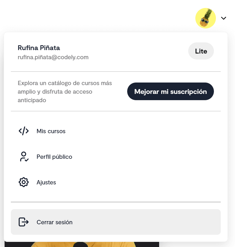
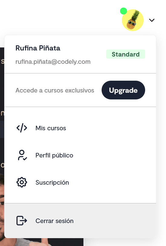
Lite subscription, we show CTA so they can access the complete catalog of the Standard plan
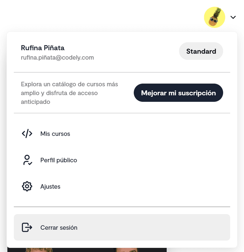
Standard subscription, we show CTA so they can access exclusive Premium courses
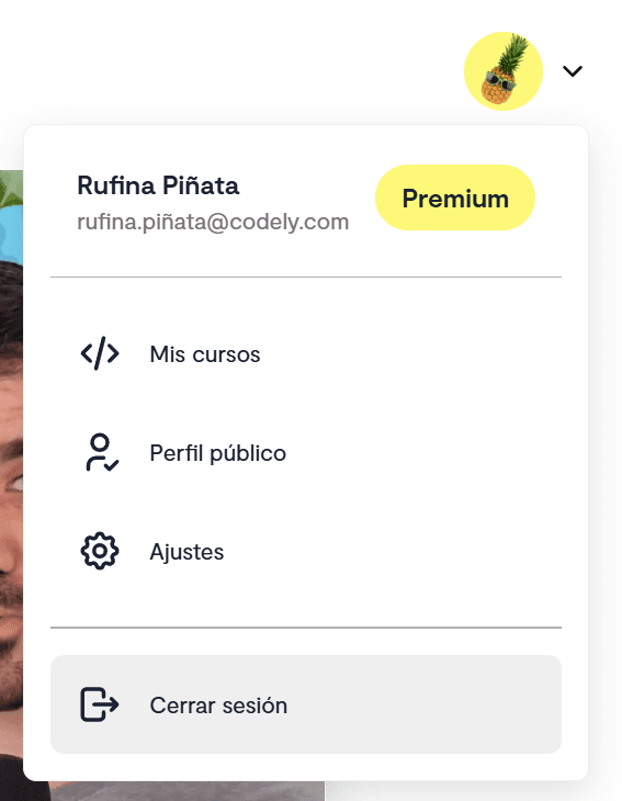
Premium subscription without upgrade CTA, since it's the most complete plan we have today
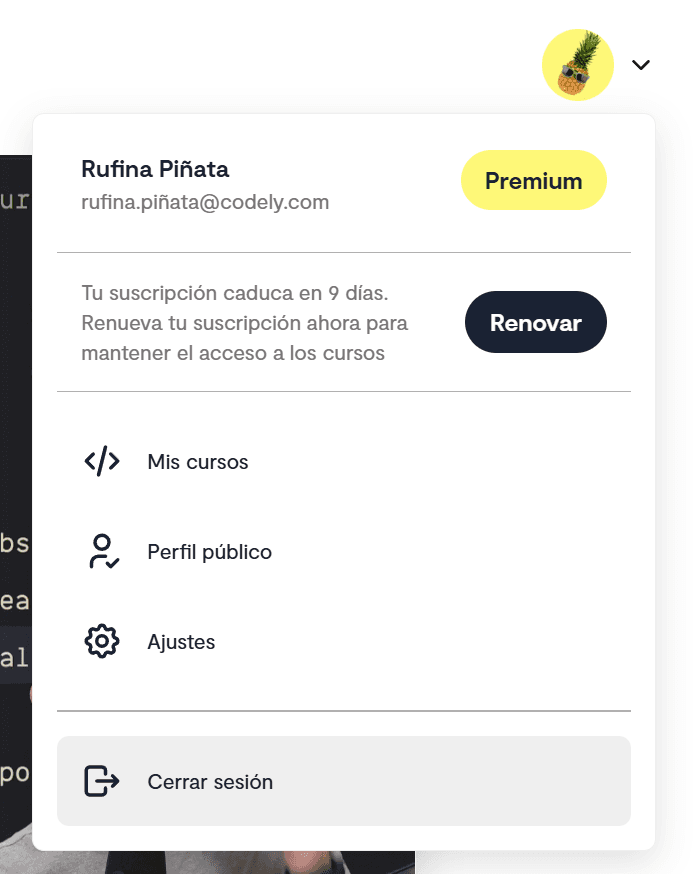
Subscription with renewal disabled, with CTA to reactivate automatic renewal. They still have access to courses, but will lose it when their remaining duration runs out
⚠️ Conveying urgency through design
This last case is especially critical from a business perspective: these are users who have already made the decision to cancel, but are still using the platform. It's our last opportunity to convince them to stay before they completely lose access. A key moment for user retention.
However, the design wasn't helping to convey the importance we wanted to give it. It looked like just another CTA, with the same relevance as the rest.
The problem of banner blindness
Here we ran into a behavior pattern we hadn't taken into account until now: if two CTAs look visually similar, the user may tend to ignore them out of habit. Like when you ignore advertising banners without realizing it.
We saw that the reactivation CTA, being visually similar to other CTAs in the menu, could go unnoticed. And this was precisely the most critical CTA for us.
The solution: Use a completely different visual design for this specific CTA 👇
- Yellow background with zebra pattern (like alert/construction)
- More urgent text: "You'll lose access in X days"
- More direct CTA: "Reactivate" instead of "Renew"
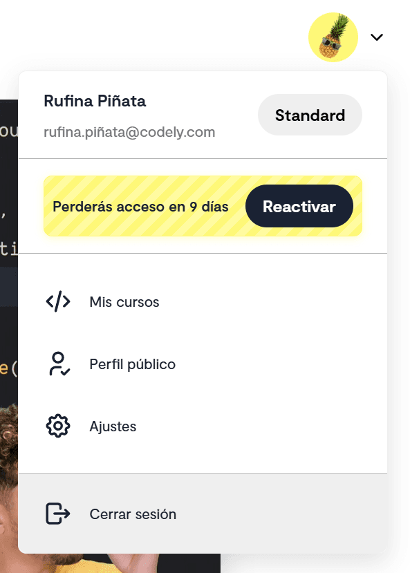
We style the renewal CTA with a different style that conveys urgency
🏷️ Don't abuse CTAs
An important aspect we had to resolve during this iteration was how to show the user's plan without it being confused with interactive buttons.
Initially, we reused the Pill component from our Design System (the same one we use for filters). But this created a UX problem: users might think they could click on the plan badge to perform some action. Since our intention was to inform, it was clear we were using the wrong tool to solve the problem.
The pill-type badge suggests interactivity, confusing the user
This made it necessary to create a Badge component specifically for non-interactive information, with:
- Different border-radius to visually distinguish it from buttons
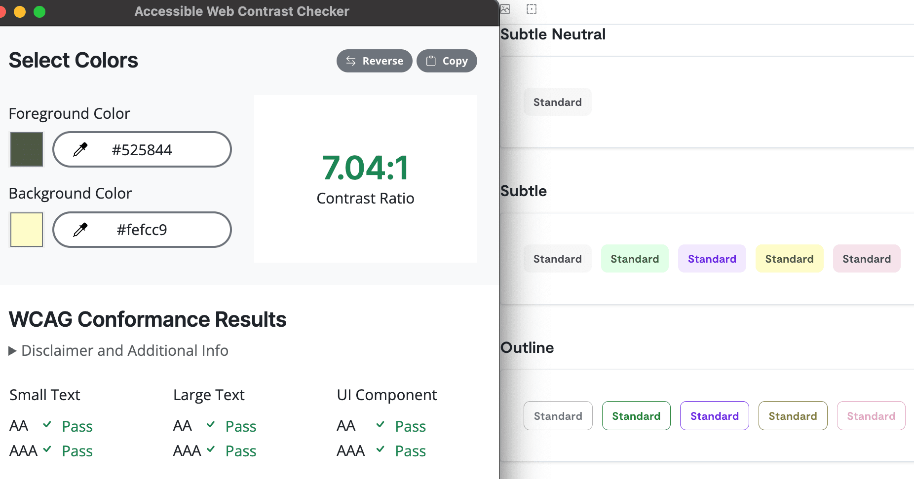
- Specific colors using the Design System's product variations
- WCAG compliance with a contrast ratio of at least 7:1
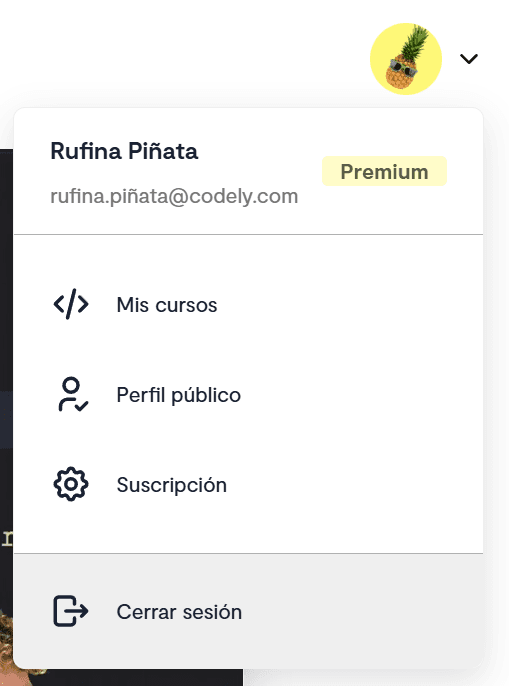
We show the current plan with a style distinct from CTAs
We maintain the design system colors while ensuring readability
This way, we maintain visual consistency but avoid confusion between informative elements (badges) and interactive elements (buttons and pills).
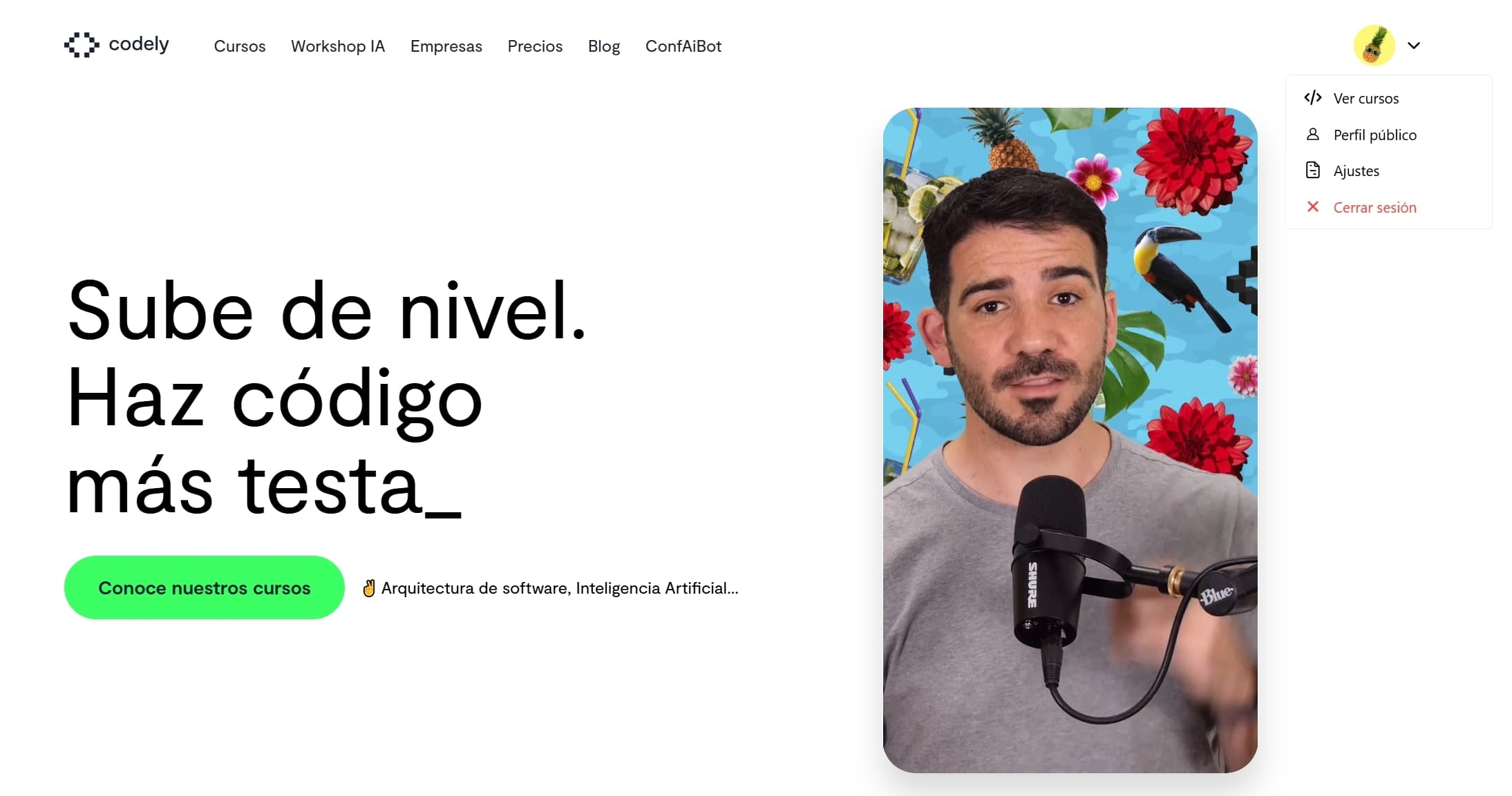
📱 Mobile design: balancing UX and accessibility
Mobile design came with its own challenges from designing desktop-first. The main question was: where to place the menu trigger?
First version where the avatar was next to the hamburger menu
The options we evaluated
- Avatar on the right, hamburger menu on the left: The hamburger menu is far from the thumb, but it's a common position. Applications like Gmail use this layout.
- Avatar on the left, keep hamburger menu on the right: Hamburger menu more accessible to the thumb, but makes it harder to access the user menu. Also, it's a less commonly used layout.
- Unify everything in the hamburger menu: It's how Vercel and others in the industry do it, but we would lose quick access to the user menu.
Final decision: Move the hamburger menu to the left, keep the avatar on the right, and center the logo in the middle.
We keep both menus comfortable to access on mobile
Open menu on mobile
Why this option? We decided to prioritize the accessibility of the user menu over having a more minimalist header, avoiding having to make many clicks to access it.
Although option 3 (unify everything in the hamburger menu) would have resulted in a cleaner design, it would have caused hiding access to the user menu that we had so optimized for conversion. We prefer to load the header a bit more while keeping both elements visible and accessible. Especially considering that the user menu had become a tool for suggesting the next step for the user to take.
⚙️ One more twist
After implementing all these contextual CTAs, we realized we were depending on the user opening the menu to see that there was something important to review.
This was especially critical in cases like users with subscriptions about to be cancelled.
The solution was to add a notification dot on the avatar when there's something relevant that requires the user's attention. This way, we catch their attention and communicate that there's something to review without them having to open the menu.
Indicating to the user, without having to click, that there's something to see
This small detail transforms a passive element into an active one: instead of waiting for the user to explore on their own, we give them a clear signal that there's something that deserves their attention.
🎓 Key learnings
1. Research is part of the functionality
Dedicating time to analyze how reference products do it is an investment in knowledge. It allowed us to save hours of blind iteration.
2. Context is gold
A user menu isn't just navigation, it's a contextual conversion opportunity. Each variation of the user's state is an opportunity to show information and relevant actions that wouldn't matter as much in another situation.
3. If it looks like a duck and walks like a duck...
Visually distinguishing informative from interactive elements isn't just aesthetics, it's UX.
An informative component that looks like a button without being one generates frustration. A critical CTA that looks like the less important ones gets ignored. Visual style should reflect function, not just look "pretty".
4. Iterate with purpose
Each iteration should focus on solving a problem. It's not iterating for the sake of iterating, but to move forward in a specific direction.
🤝 Conclusion
What started as a "simple" component became an exercise in product design and teamwork.
Each decision, from the position of an icon to the color of a CTA, impacts the user experience. And, ultimately, the identity of our product.
The process we followed (initial proposal, research, iteration) is applicable to any product feature. The key is learning from industry references, while taking into account the specific needs of our users.
Even despite starting with a "backend" implementation, we think we've done a good job with the component. We've managed to bring it up to the level of the rest of the app. With collaboration and an iterative process, we've managed to bring industry best practices to our particular case.
Final version after the entire iteration process
What did you think of this process? Have you had similar experiences iterating on seemingly "simple" components? We'd love to hear about your experience on Twitter or LinkedIn.